Odoo GUI and Master Data
Search and filter records
Odoo uses filters to include only the most relevant records depending on the purpose of the view you are on. However, you can edit the default filter or search for specific values.
Preconfigured filters
You can modify the default selection of records by clicking Filters and selecting one or several preconfigured filters.
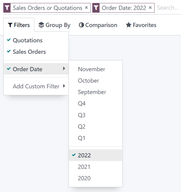
Example
On the Sales Analysis report, only records at the sales order stage are selected by default. However, you could also include records at the quotation stage by selecting Quotations. Furthermore, you could only include records from a specific year, for example 2022, by selecting Order Date ‣ 2022.
Note
If you select preconfigured filters from the same group (i.e., that are not separated by an horizontal line), the records can match any condition to be included. However, if you select filters from different groups, the records have to match all condition to be included.
Custom filters
You can create custom filters using most fields present on the model by clicking Filters ‣ Add Custom Filter, selecting a field, an operator, a value, and clicking Apply.
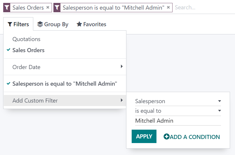
Example
You could only include records from a single salesperson on the Sales Analysis report, for example Mitchell Admin, by selecting Salesperson as the field, is equal to as the operator, and typing Mitchell Admin as the value.
Note
If the records should only match one of several conditions, click Add a condition before applying a custom filter. If the records should match all conditions, add new custom filters instead.
Search for values
You can use the search field to quickly look for specific values and add them as a filter. Either type the full value you are searching for and select the desired field, or type a part of the value, click the dropdown button (⏵) before the chosen field, and select the exact value you are looking for.
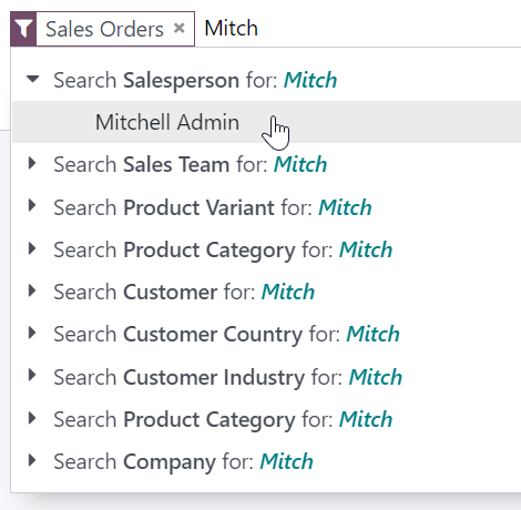
Example
Instead of adding a custom filter to select records where Mitchell Admin is the salesperson on the Sales Analysis report, you could search for Mitch, click the dropdown button (⏵) next to Search Salesperson for: Mitch, and select Mitchell Admin.
Note
Using the search field is equivalent to using the contains operator when adding a custom filter. If you enter a partial value and directly select the desired field, all records containing the characters you typed for the selected field will be included.
Group records
You can click Group By below the search field to cluster records together according to one of the preconfigured groups.
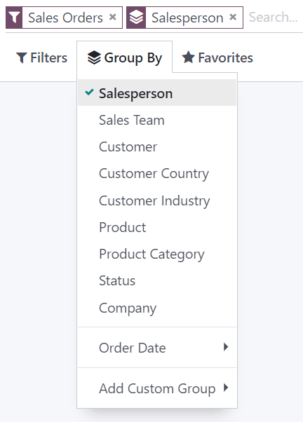
Example
You could group the records by salesperson on the Sales Analysis report by clicking Group By and selecting Salesperson. No records are filtered out.
You can also custom groups by using a wide selection of fields present on the model. To do so, click Group By ‣ Add Custom Group, select a field, and click Apply.
Note
You can use several groups at the same time. The first group you select is the main cluster, the next one you add further divides the main group’s categories, and so on.
Reporting
You can find under the Reporting menu of most apps several reports that let you analyze and visualize your records’ data.
Selecting a view
Depending on the report, Odoo can display the data in various ways. Sometimes, a unique view fully tailored to the report is available, while several views are available for others. However, two generic views are dedicated to reporting: the graph and pivot views.
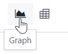
Graph view
The graph view is used to visualize your records’ data, helping you identify patterns and trends. The view is often found under the Reporting menu of apps but can be found elsewhere. Click the graph view button located at the top right to access it.
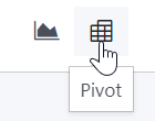
Pivot view
The pivot view is used to aggregate your records’ data and break it down for analysis. The view is often found under the Reporting menu of apps but can be found elsewhere. Click the pivot view button located at the top right to access it.
Choosing measures
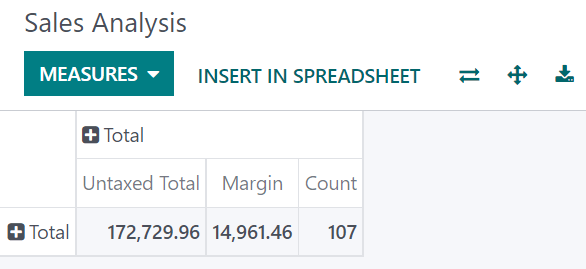
After selecting a view, you should ensure only the relevant records are filtered. Next, you should choose what is measured. By default, a measure is always selected. If you wish to edit it, click Measures and choose one or, only for pivots, multiple measures.
Note
When you select a measure, Odoo aggregates the values recorded on that field for the filtered records. Only numerical fields (integer, decimal, monetary) can be measured. In addition, the Count option is used to count the total number of filtered records.
After choosing what you want to measure, you can define how the data should be grouped depending on the dimension you want to analyze. By default, the data is often grouped by Date > Month, which is used to analyze the evolution of a measure over the months.
Tip
When you filter a single time period, the option to compare it against another one appears.
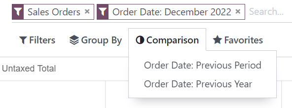
Example
Select measuresGroup measures
Among other measures, you could add the Margin and Count measures to the Sales Analysis report. By default, the Untaxed Amount measure is selected.
Using the pivot view
Grouping data is quintessential to the pivot view. It enables drilling down the data to gain deeper insights. While you can use the Group By option to quickly add a group at the level of rows, as shown in the example above, you can also click the plus button (➕) next to the Total header at the level of rows and columns, and then select one of the preconfigured groups. To remove one, click the minus button (➖).
Once you have added a group, you can add new ones on the opposite axis or the newly created subgroups.
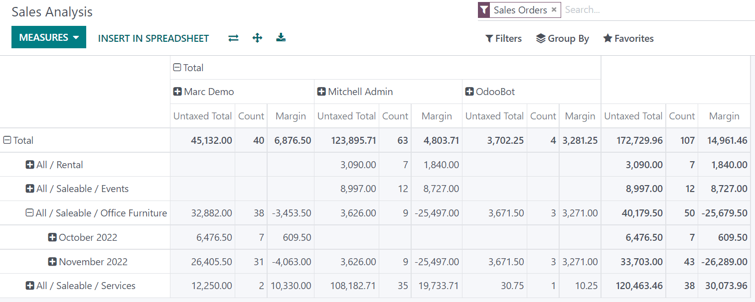
Example
You could further divide the measures on the previous Sales Analysis report example by the Salesperson group at the level of columns and by the Order Date > Month group on the All / Saleable / Office Furniture product category.
Tip
Switch the rows and columns’ groups by clicking the flip axis button (⇄).
Click on a measure’s label to sort the values by ascending (⏶) or descending (⏷) order.
Download a .xlsx version of the pivot by clicking the download button (⭳).
Using the graph view
Three graphs are available, the bar, line, and pie charts.
Bar charts are used to show the distribution or a comparison of several categories. They are especially useful as they can deal with larger data sets.
Line charts are useful to show changing time series and trends over time.
Pie charts are used to show the distribution or a comparison of a small number of categories when they form a meaningful whole.
Bar chartLine chartPie chart
Tip
For bar and line charts, you can use the stacked option when you have at least two groups, which then appear on top of each other instead of next to each other.
Stacked bar chartRegular bar chart
For line charts, you can use the cumulative option to sum values, which is especially useful to show the change in growth over a time period.
Cumulative line chartRegular line chart
ON THIS PAGE
| المشاهدات | |
|---|---|
| 4 | مجموع المشاهدات |
| 4 | مشاهدات الأعضاء |
| 0 | المشاهدات العامة |
| الإجراءات | |
|---|---|
| 0 | الإعجابات |
| 0 | عدم الإعجاب |
| 0 | التعليقات |